Todays Quick Dev Tip was shown to me by my friend and now I use it all the time!
Did you know you can use some of the buffer view modes to help you quickly make icons from your in-game assets?
If you would prefer to watch the video version, check it out here
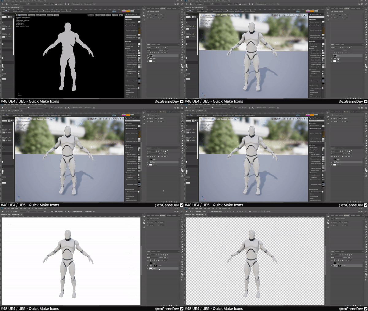
For my example, I’m going to take the skeletal mesh mannequin and turn it into an icon. First up you want to find an angle that you like and make sure the asset fills a large amount of the screen space. Then we want to hit the Print Screen key on your keyboard, this is normally the next key along from the F12 key.
We then want to open up photoshop, make a new file and Ctrl + V to paste in the image.
Then we want to head back to our Unreal Engine Editor and without moving the camera, change the view mode, by clicking on the Lit button in the top left of the view window. Then going down to Buffer Visualization and then clicking on Specular.
Then you will see the mode we are after. We want to use this as a mask. So we need to again Print Screen. Making sure we haven’t moved the camera.
Then again Ctrl + V to paste this new image into Photoshop on top of the first image.
Here is where we pull it all together. We need to select the area for the mask. So the way I like to do this in Photoshop is to go to the top bar, hit Select then pick Colour Range. Using the colour picker select the grey area of the mannequin (you may need to bring down your Fuzziness value) then hit Ok. This will give you a selection.
Then we need to hide the layer that we just made a mask from. Using the selection we have and making sure that you are on the first image we pasted in press the make mask button in the bottom right of photoshop (looks like a rectangle with a hole in it) and then delete out the white background layer.
Scale it down to the file size you need, give it a save and import it into your editor, and there you have it. A quick and easy way to get an icon that looks exactly like your in-game asset! If you had trouble following along with the photoshop part of this explanation, I would suggest watching the Youtube video version which you can check out here
If you want to add a little more polish you can play around with the preview scene settings on the right-hand side of your asset view window. As you can see you can access a bunch of post, lighting and colour settings so that you can use to match the style of your game when viewing your asset.
You can use this exact same technique in the Early Access of Unreal Engine 5.
I like this a lot and use it all the time to quickly create icons that look exactly like my in-game icons.
If you want more quick tips & tricks FOLLOW ME ON TWITTER @cbGameDev
Also, check out the parkour game I'm solo developing called Freerunners. Give it a wishlist if you like the way it looks!: https://store.steampowered.com/app/1430330/Freerunners/


