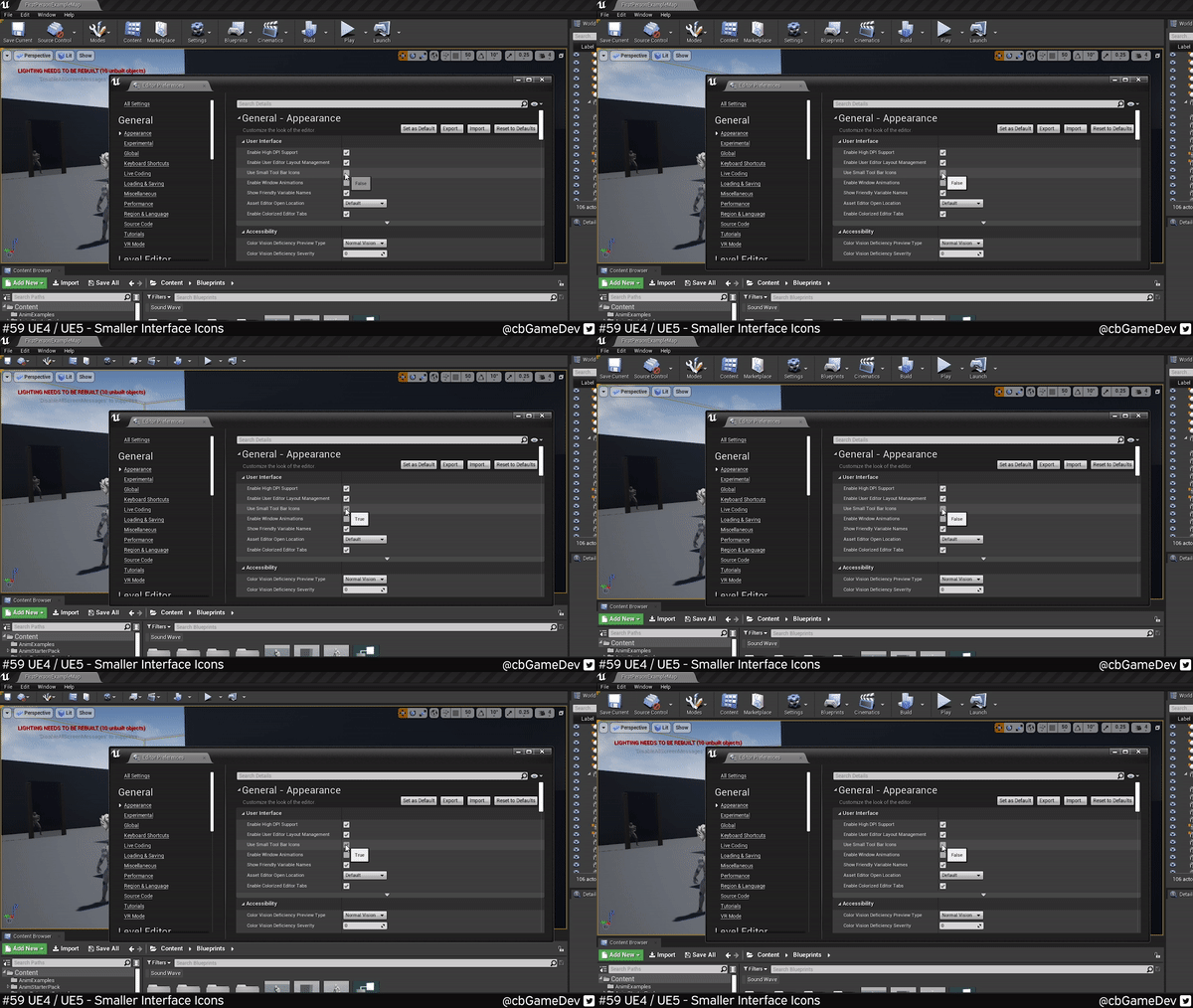
Today’s tip is great for if you are only working on a single screen and you want to maximise your viewport space!
Did you know you can make your main toolbar editor icons smaller?
If you would prefer to watch the video version, check it out here
By the main toolbar, I mean the important options that run along the top of your viewport.
This is very easy to do. We need to head up to Edit -> Editor Preferences.
We need to go to the Appearance category (from the left hand list), then look for the User Interface section. Here we will find the setting we are after called Use Small Tool Bar Icons.
If we turn this setting On/Off you can see how the top bar shrinks. The icons become smaller and the text is removed, making for a much more streamlined UI.
This is pretty much the same process in the Early Access version of Unreal Engine 5 as well. In the Editor Preferences under the Appearance tab, you will need to roll down the options as the User Interface category is no longer the top option. But the setting is still named the same.
If we turn on/off the setting we will see it changes but it is a lot less obvious. The names are removed but because UE5’s UI is already more compact it means there is less of a change!
A lot of people seem to like this and I think using this setting is probably good for people who have been using Unreal Engine for a while and know what the different icons do without needing the text!
If you want more quick tips & tricks FOLLOW ME ON TWITTER @cbGameDev
Also, check out the parkour game I'm solo developing called Freerunners. Give it a wishlist if you like the way it looks!: https://store.steampowered.com/app/1430330/Freerunners/


